


Suche
 Häufig gesucht
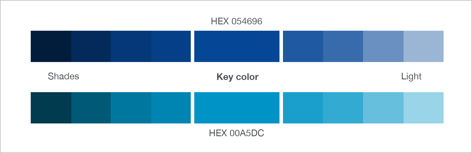
General Information
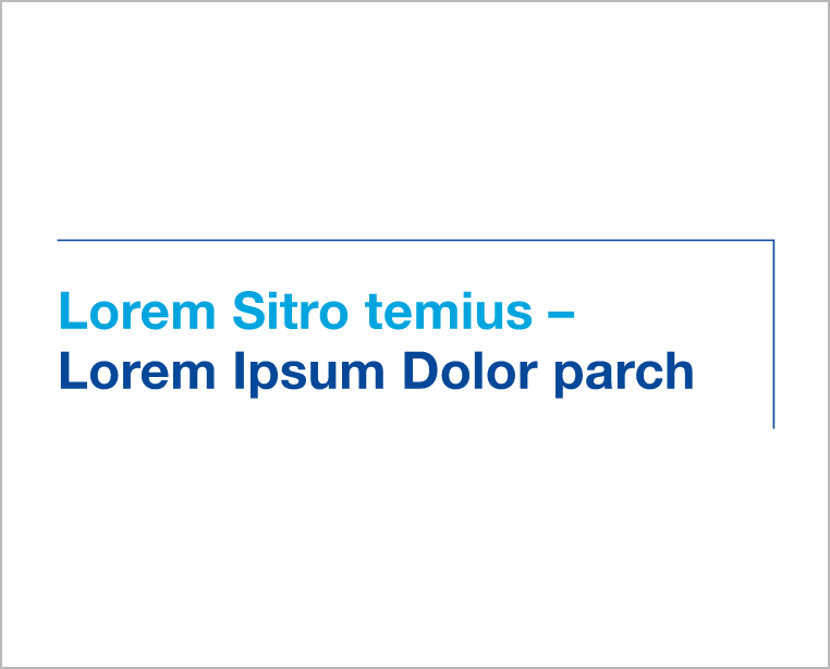
WHU Hairline
The WHU Hairline is a key design. It frames headlines on two sides and can connect them to images or color areas—mainly used on covers and bold media.
The line should not cross key image areas and must have enough contrast.
In colored areas with text, it always runs behind the text for readability.
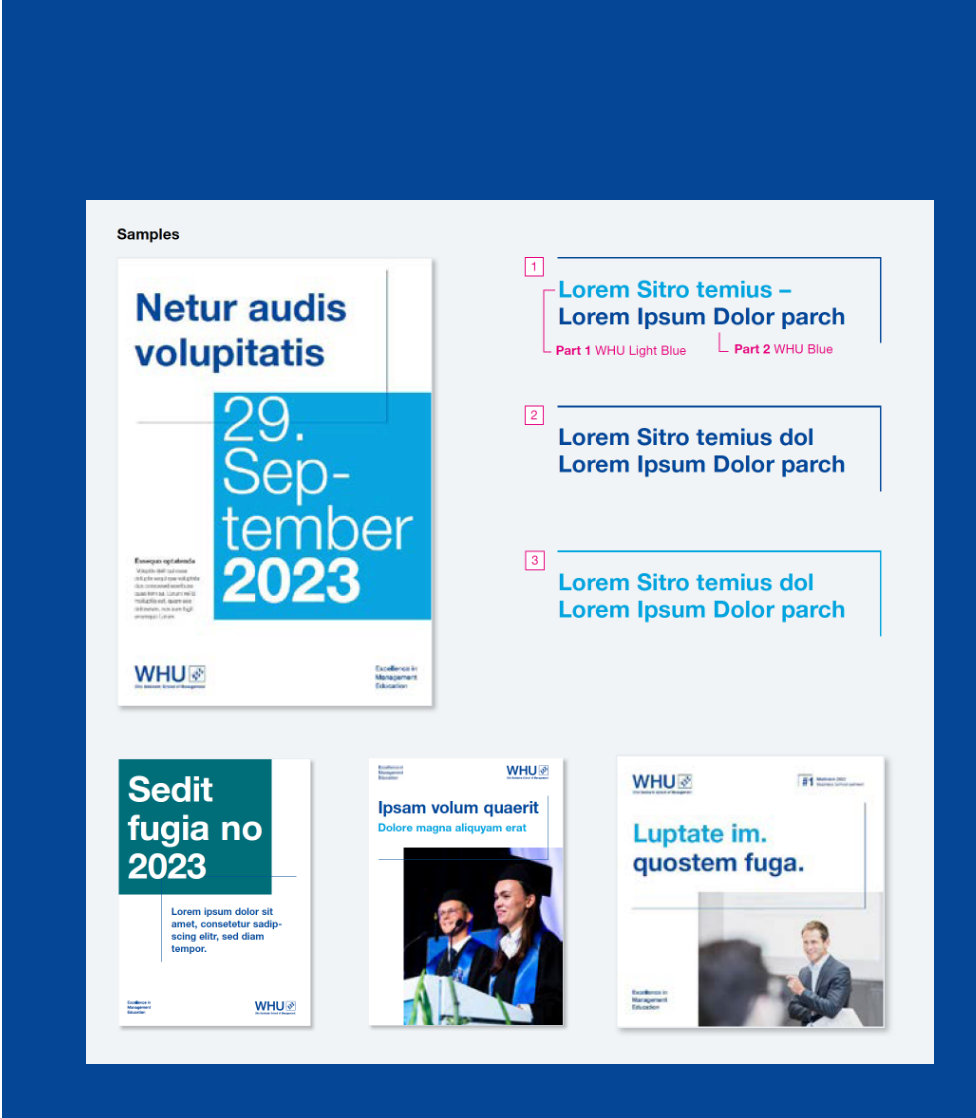
Two-part headline
Separated by a full stop, a dash, or a thematic separation:
Text in WHU Light Blue and WHU Blue, WHU Hairline in WHU Blue.
WHU’s print design is based on clear structure, defined grid systems, and consistent spacing.
It ensures a professional and recognizable appearance across all printed materials—for brochures, flyers, and more.
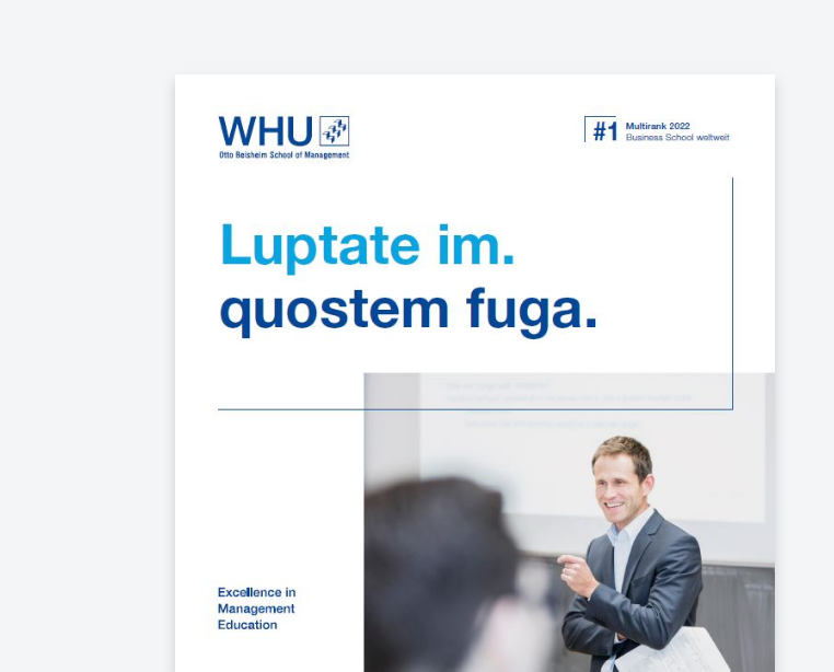
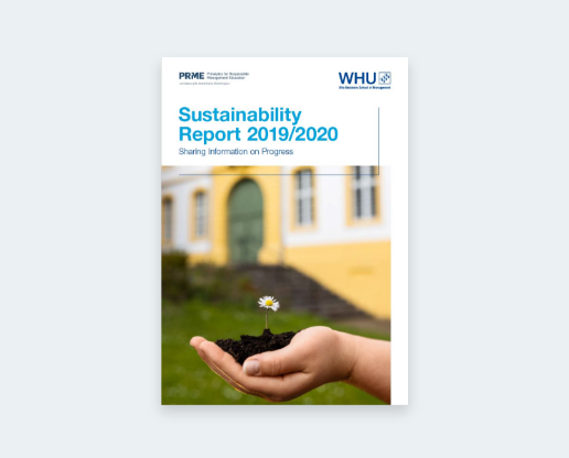
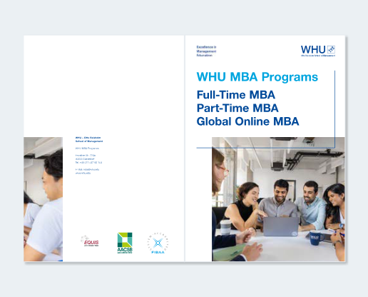
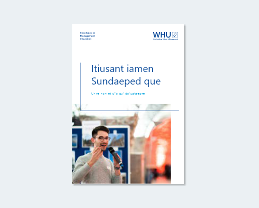
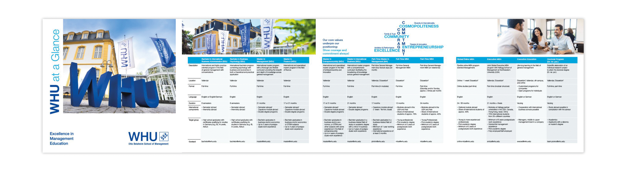
Cover page
All title and back pages follow the layout structure shown here.
Content should remain within the defined type area and be arranged in columns to ensure clarity and consistency.
Front / Title
Title pages may include photo motifs or illustrations that extend to one or two edges of the format. The WHU Hairline always frames the headline and may overlap the image if needed.
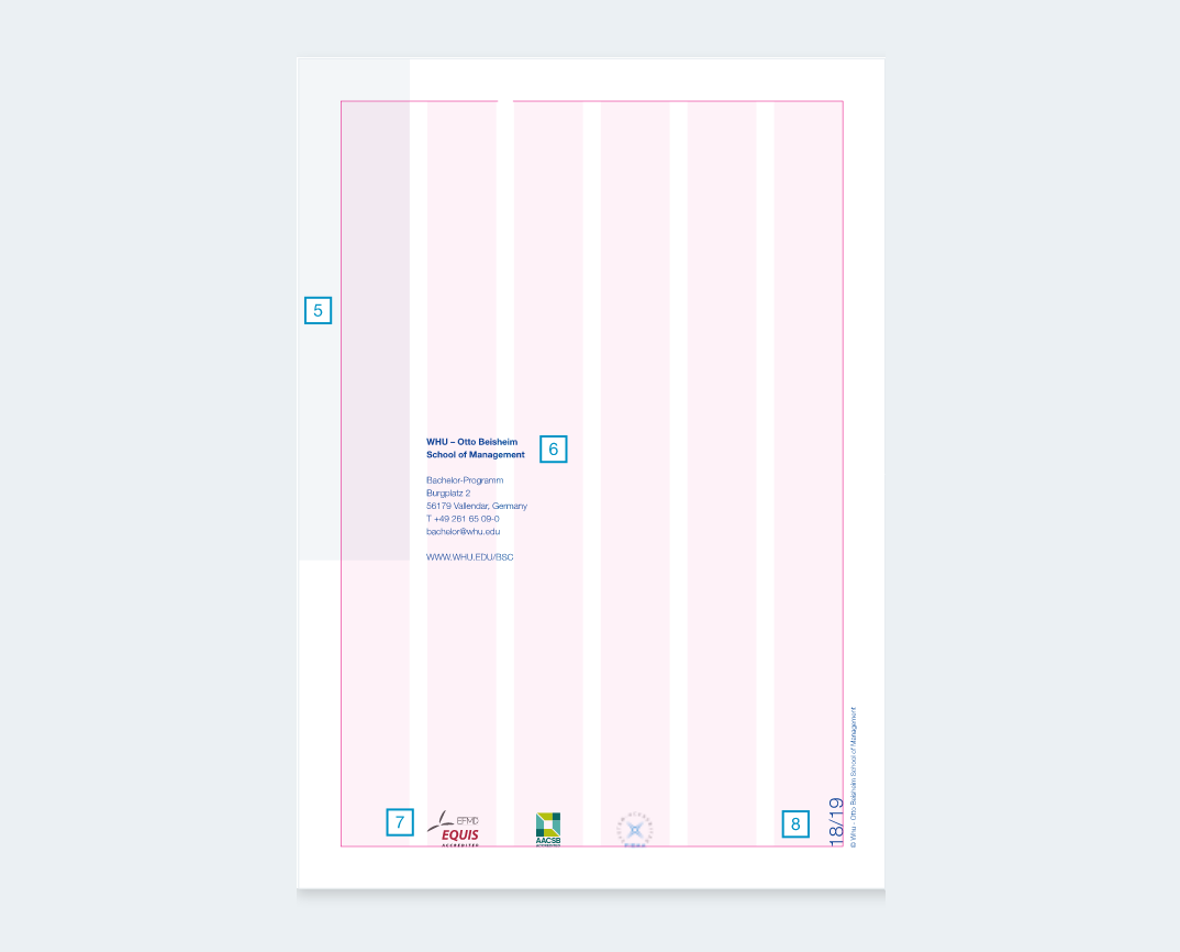
Back
Back pages follow the same grid and type area as the front.
Images may extend across to create a seamless impression.
Contact details and institutional notes are set within the grid, while accreditation logos (EQUIS, AACSB, FIBAA) are mandatory at the bottom.
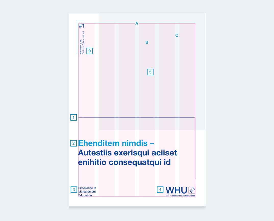
Construction
WHU Line:
1 pt
Headline:
Bold
Claim
Logo
Title image:
continuing on back
Address:
Bold / Light,
9 pt / 13 pt Line Spacing
Accreditation logos
Date / Year:
Light
Graphics for awards:
optional
Cover page samples
Inner page
Inside pages follow the defined type area of the chosen format.
Content is set generously with ample white space, in line with WHU’s corporate design. Using multiple columns ensures flexibility and a well-structured layout.
Content & Margin
The margins for the example:
Top: 15 mm
Bottom: 25 mm
Outside: 15 mm
Inside: 25 mm
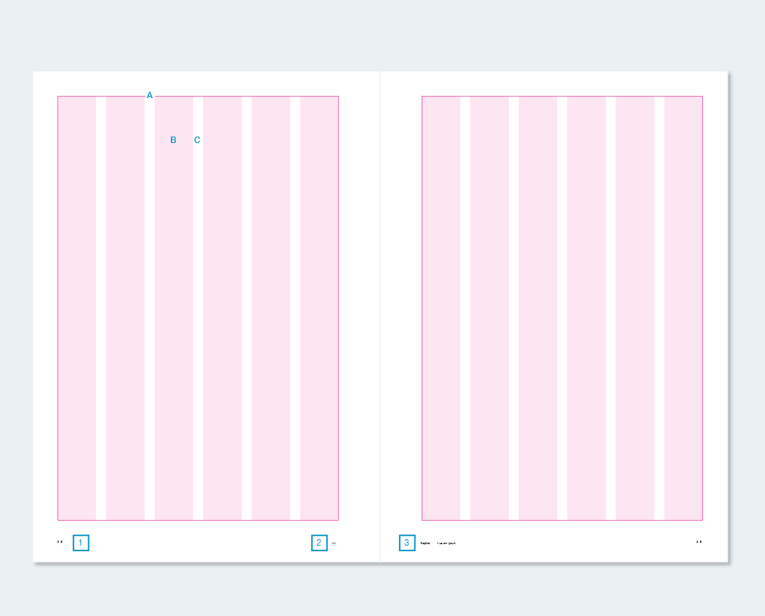
Construction
Page number
Chapter number
Chapter name / Column title
Cover page samples
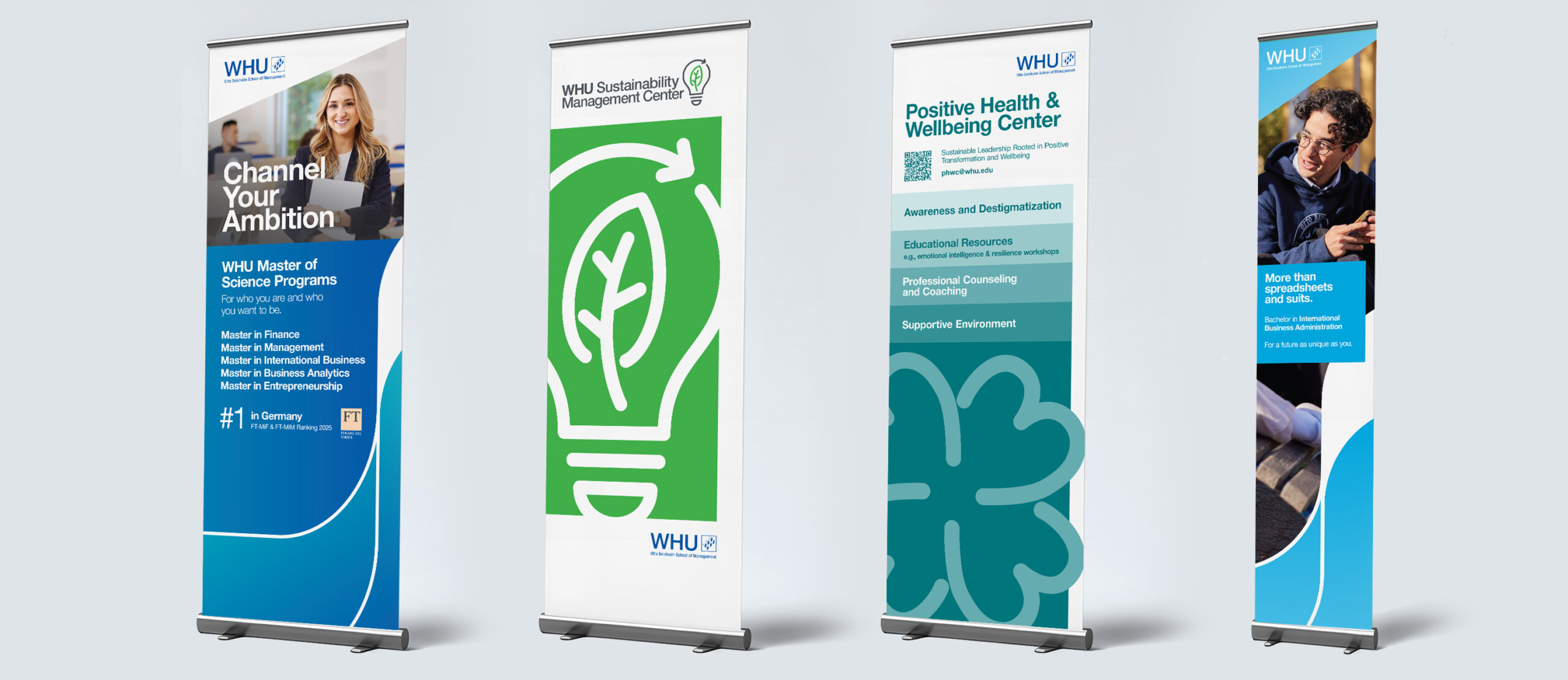
Flag & Roll-Up samples
Digital
WHU’s digital design ensures a consistent and user-friendly brand experience. Whether on the website or in social media, layouts are structured, accessible, and adaptable. Spacing, alignment, and typography follow the same principles as in print—adapted for digital use.
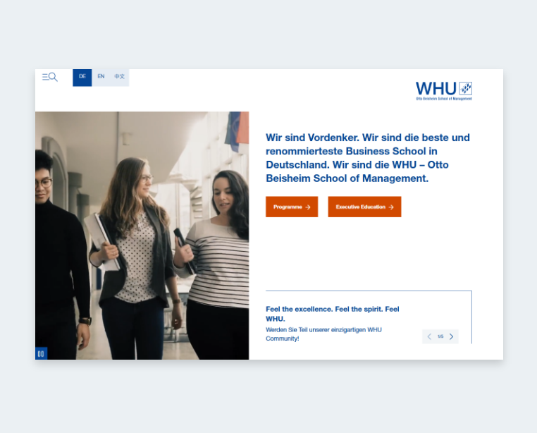
Website
For the WHU website and future landing pages, sufficient contrast between text and background is key for accessibility and readability. All elements should meet WCAG standards, especially when using WHU brand colors. This ensures a consistent and user-friendly experience across all devices.


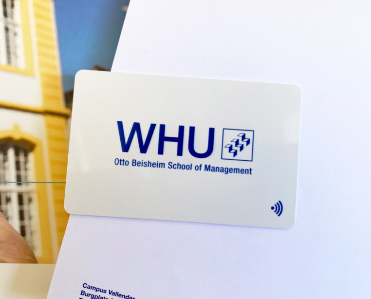
Internal communication
A consistent visual language in internal communication reinforces professionalism and reflects WHU’s brand values.
Business cards, folders, and handouts should follow the design principles for a unified appearance.
Business Cards samples
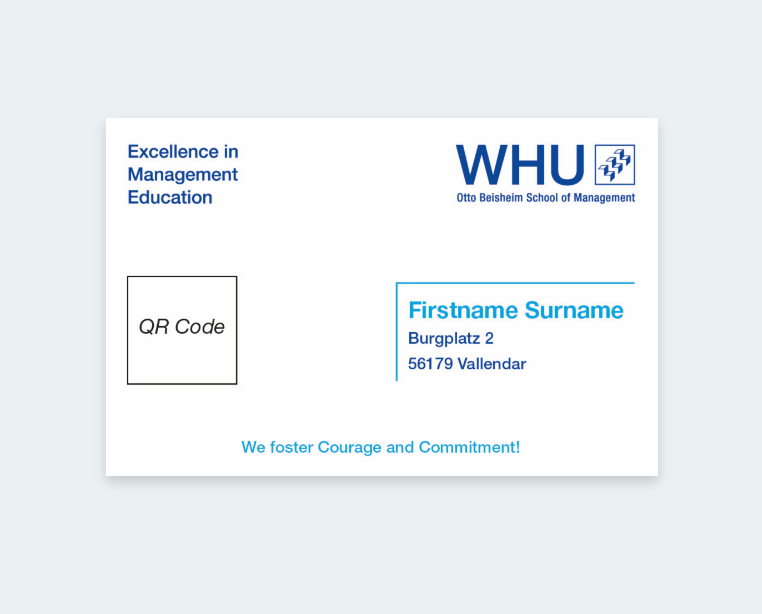
Digital Business Card
Designed for online use with QR code and contact details.
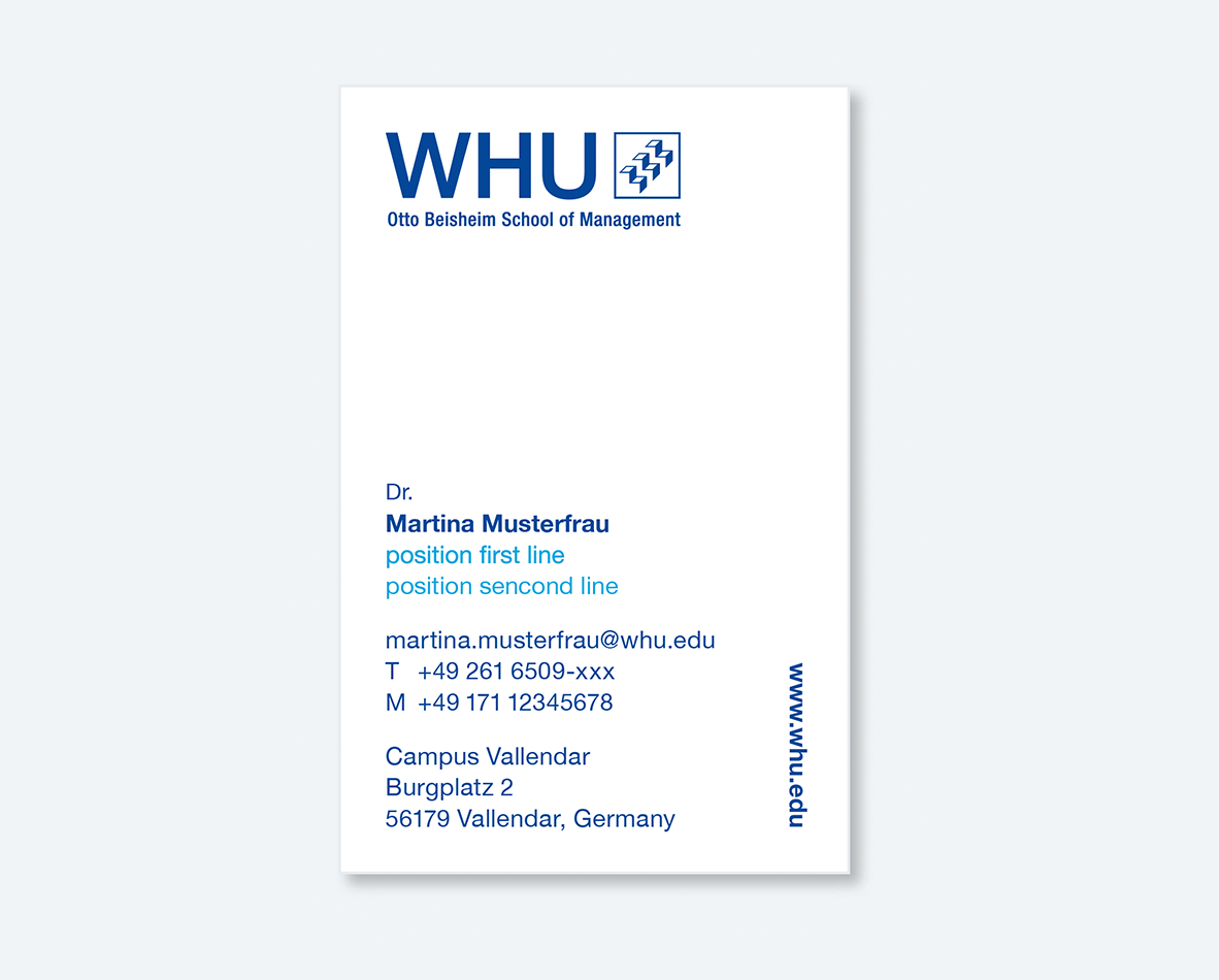
Print Business Card
Classic layout with name, title, and full contact information for professional use.
Certificate & Press Folder samples
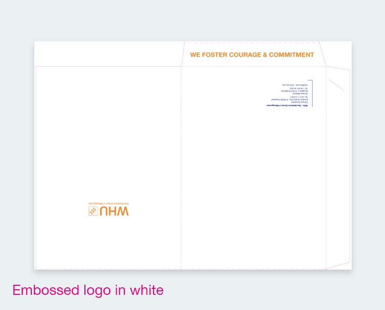
Certificate Folder
Elegant folder with embossed logo and WHU branding, designed to present official certificates.
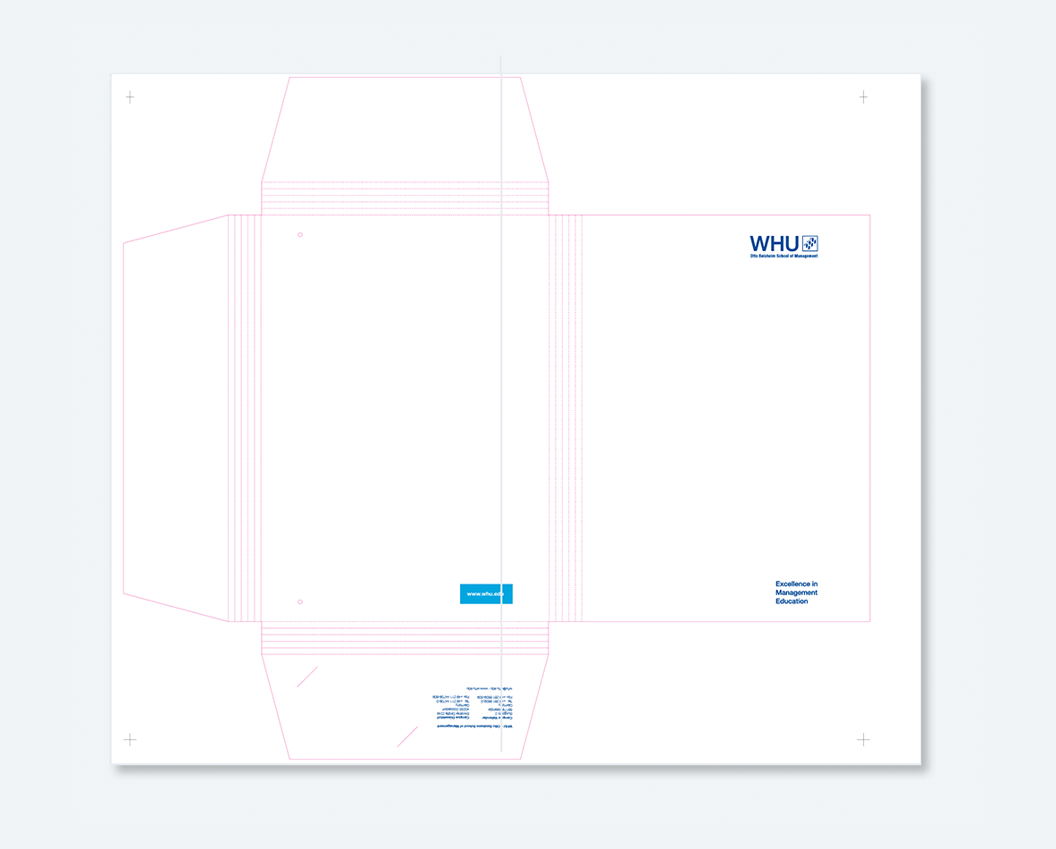
Press Folder
Practical folder with clean WHU design, suitable for press materials and documents.
Visual Design Elements
Drawing inspiration from the stylized steps of the WHU logo, a new visual language has been developed. The result is a dynamic design element that brings greater flexibility and a sense of motion to the corporate design. Versatile in its application, it reflects the multifaceted nature of WHU itself — a place where tradition meets innovation.
Design Flexibility
The new form system offers high flexibility, allowing a wide range of creative applications across digital and print formats while maintaining a consistent brand appearance.
Strong Brand Recognition
Distinctive shapes and color transitions ensure a high level of recognition within WHU’s visual world, reinforcing the brand identity across all media.Graphic & Image Integration
Graphic & Image Integration
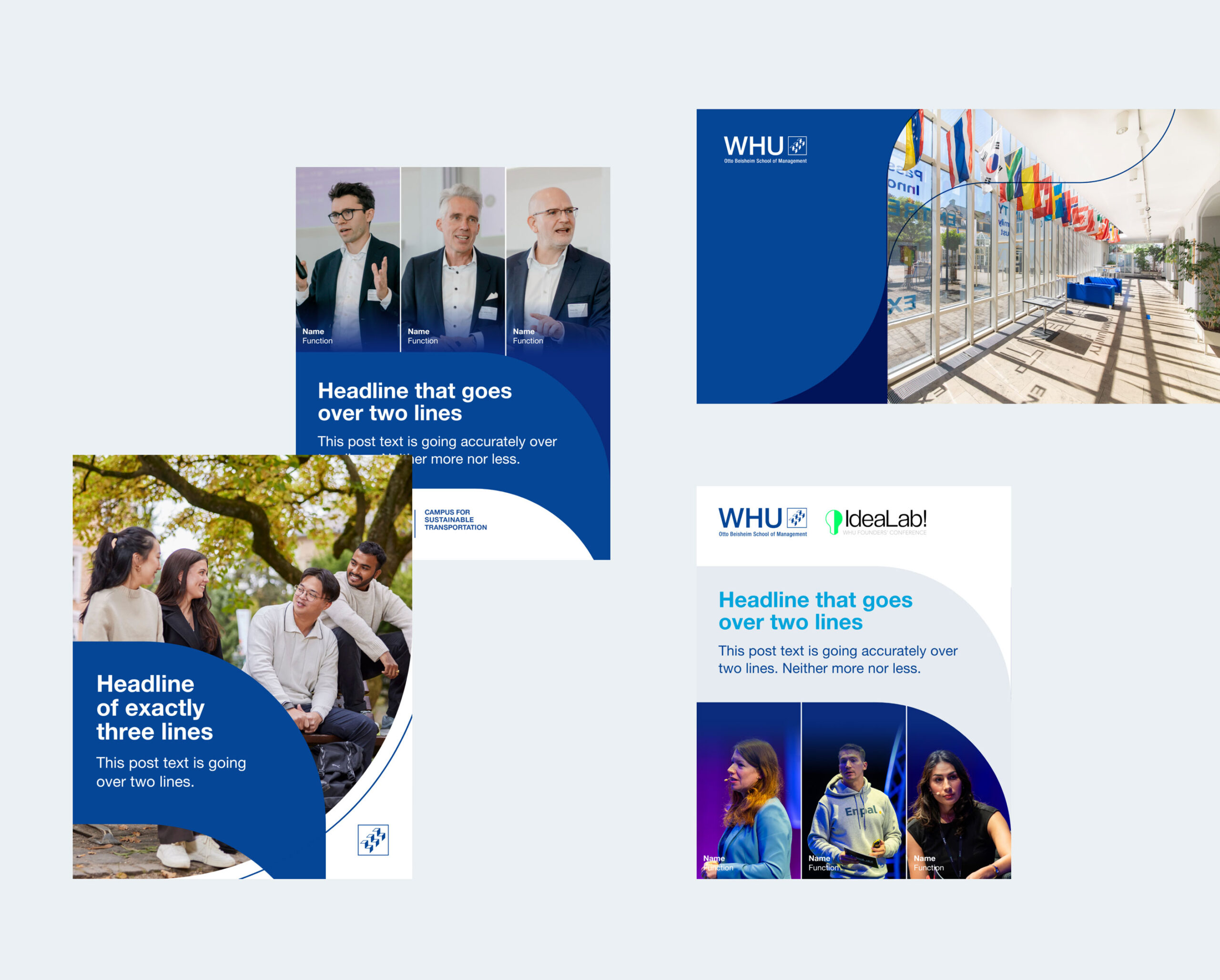
The elements can be used purely as graphic compositions or combined with imagery to create visually engaging layouts with depth and balance.
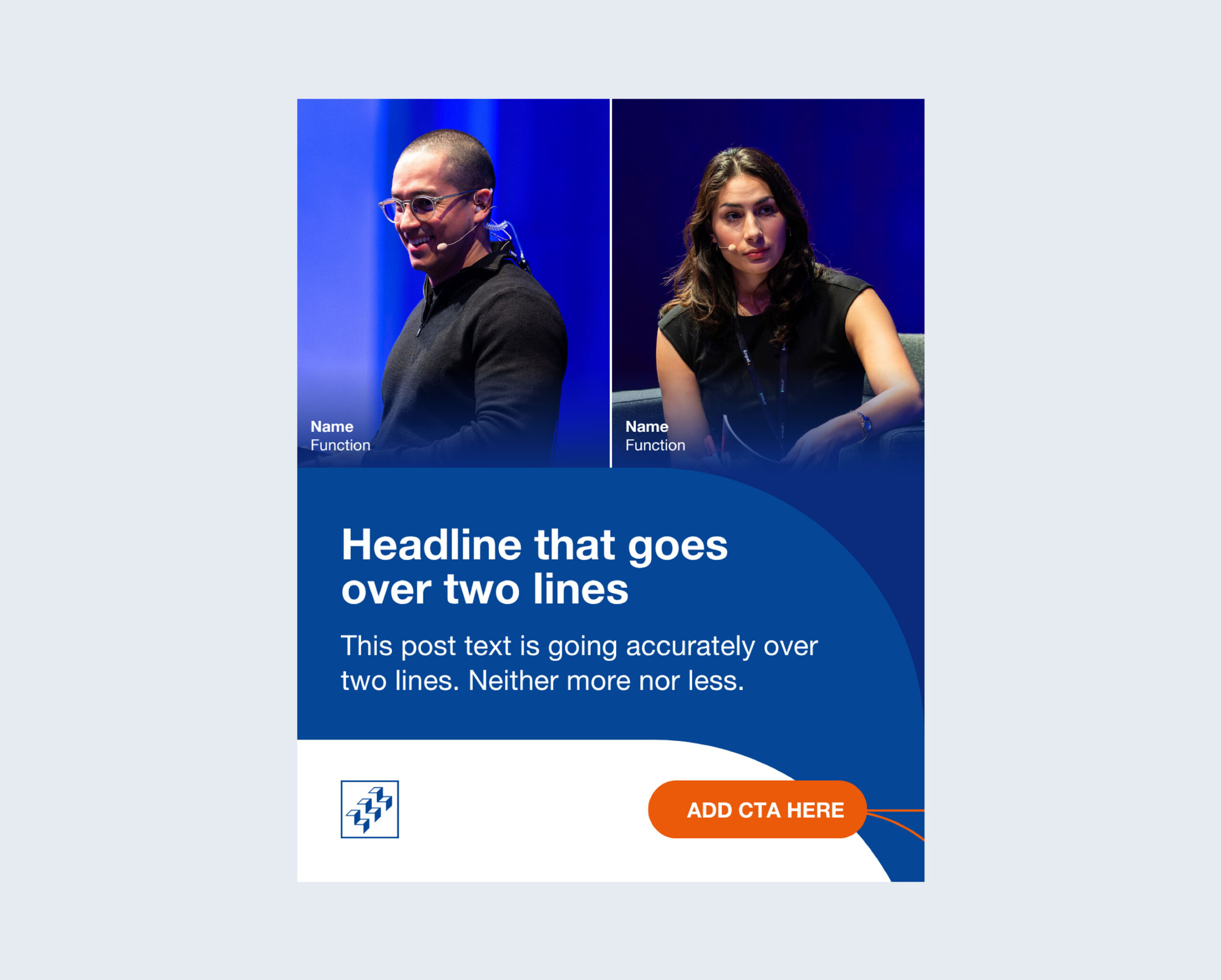
Space for Images & Typography
The flexible grid and open compositions provide more room for impactful imagery and clear typographic hierarchy, supporting expressive storytelling.
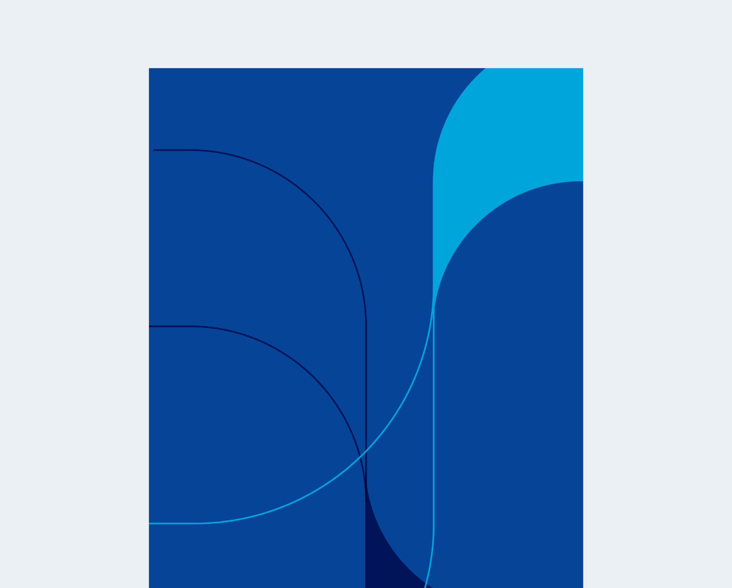
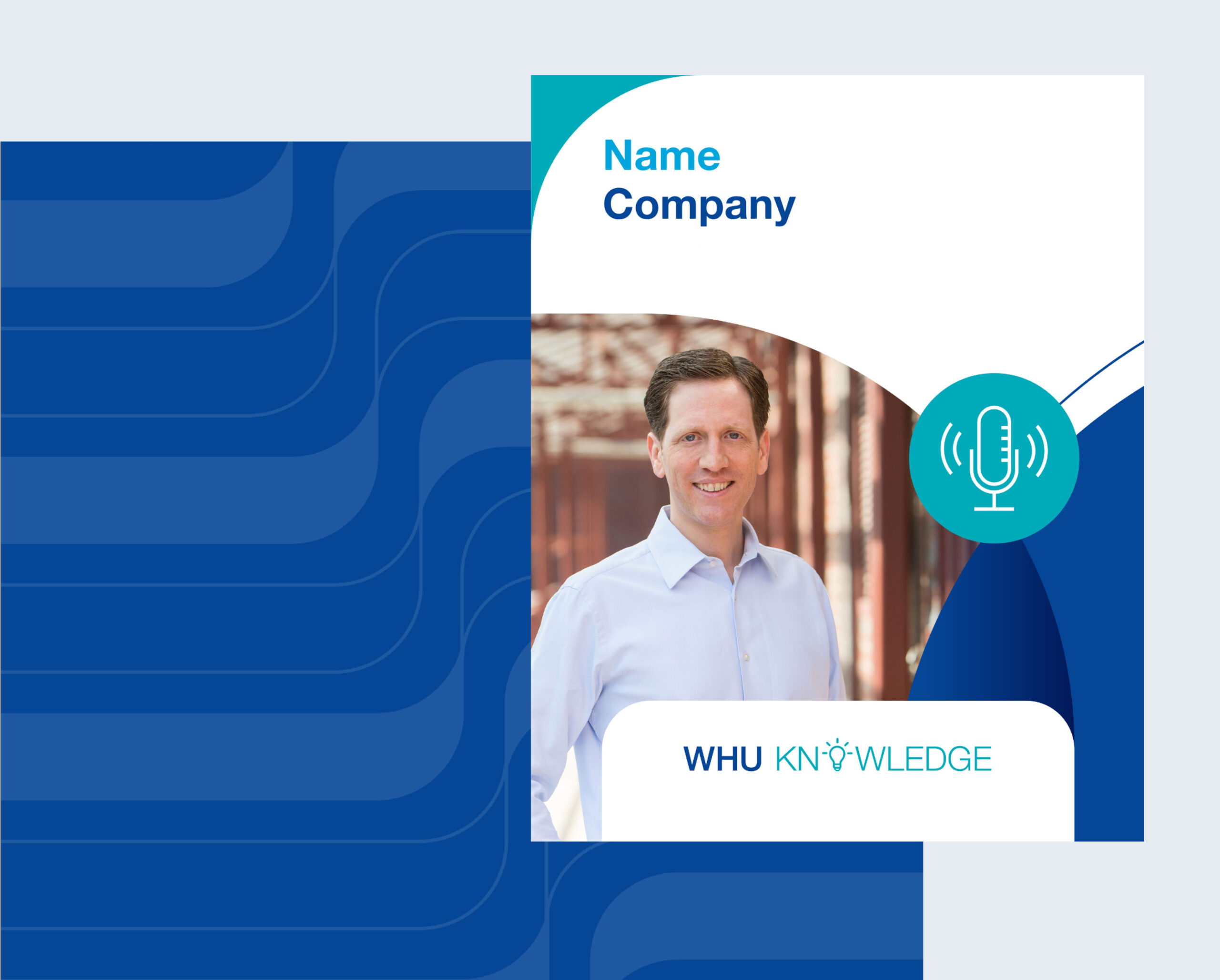
Curved Image Frames and Color Gradients
Soft, curved frames draw the viewer’s attention and introduce a dynamic flow to the layout, adding visual interest without overwhelming the content.
Color gradients serve as a bridge between image and form, seamlessly merging visual layers and enhancing harmony within the overall design.
