


Suche
 Häufig gesucht

General Information
WHU’s graphic style is clean, modern, and structured. Graphic elements like lines and shapes help organize content, highlight key messages, and guide the user’s attention.

Tables
Tables can be used in three different ways: with solid horizontal lines (Table A), with a vertical white column to separate important content (Table B), or with a colored table header for emphasis on the header (Table C).
Table A
Used with solid horizontal lines. Clear table header and body separation.
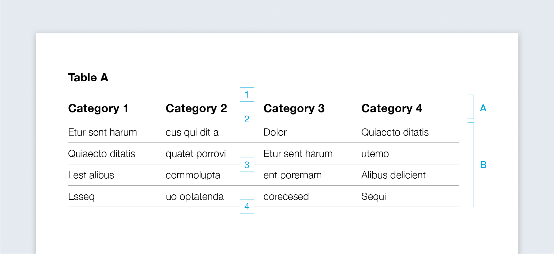
Table B
Uses a vertical white separation column to highlight important rows.
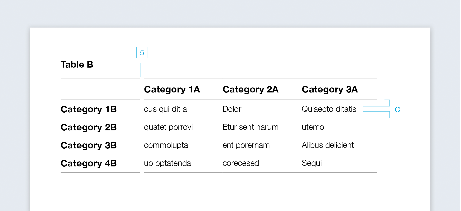
Table C
Has a colored table header for emphasis, with header and text in a primary or secondary color.

Tables follow a uniform basic structure:
Table headline:
1.25 pt, black
Table head-end line:
0.5 pt, black
Table body:
0.5 pt, black
Table end line:
1 pt, black
Separation column:
horizontal lines without contour
Colored table header:
table header and text in a primary or secondary color
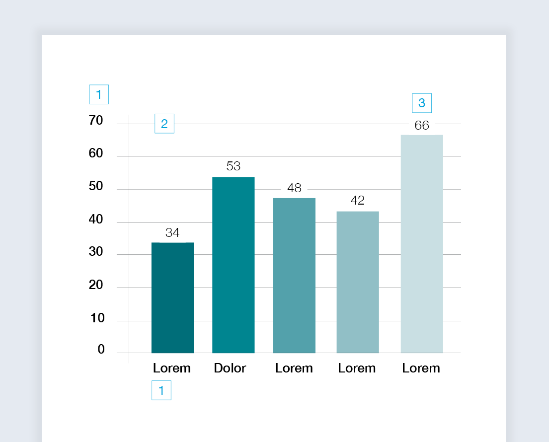
Diagrams
Bar chart
Diagrams help visualize numbers and values. They are mainly used in the Highlight Color WHU Dark Petrol and its half-tones.
Donut chart
Instead of using further half-tones of WHU Dark Petrol, WHU Petrol can also be used.

Further half-tones can be added to highlight important data, such as WHU Yellow, WHU Orange, or WHU Green.

Line chart
Should the chart need strikingly different colors for the sake of readability, more highlight colors can be used.

Construction
Lettering
Medium, black
Background line:
0.25 pt, WHU Anthracite
Diagram value:
Light, black
Chart title:
Bold, black
Dividing line (optional):
1 pt, black
Legend
Legend captions:
Medium, black
Background (optional):
WHU Silver Gray 60%
Labeling line:
0.25 pt, WHU Anthracite
Line chart:
1 pt
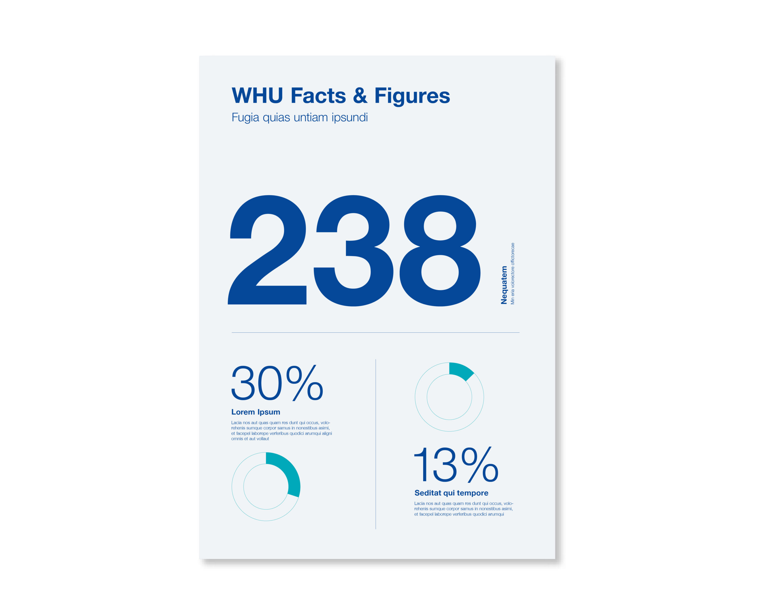
Infographics
Infographics provide the opportunity to present and emphasize concise information and facts. The graphics can be composed of typography, reduced diagrams, and lines.
In most cases, the primary colors WHU Blue and WHU Light Blue are used. Highlight colors can be used for important information, but one infographic should never have more than one highlight color.
Icons
WHU uses a custom icon style defined by consistent line width and clear symbolism. Icons serve as supporting visuals for specific themes or keywords and may be reused across different contexts. To maintain clarity and consistency, one icon should not represent multiple meanings within a single medium (e.g., a brochure).
Icons are available with two different line weights:
-
Use the thicker line weight when displaying icons in a relatively small size.
-
Use the thinner line weight when displaying icons at a relatively large size.
This ensures that icons remain clear, legible, and stylistically consistent across various applications.

Gradient Overlay
Several filters and effects can be applied to images for more stylistic options.
This can be utilized to add visual variety or increase the contrast of text placed on top of or overlapping with images.
Overlay Blue
Several primary or secondary colors can be overlaid with images using varying opacity.
![[12] Overlay Blue](https://whu.muenchimpact-projekte.com/wp-content/uploads/2025/10/12-Overlay-Blue-scaled.jpg)
Overlay Black
We usually recommend darker colors like WHU Blue, WHU, or black to create contrast for overlaying text.
![[13] Overlay Black](https://whu.muenchimpact-projekte.com/wp-content/uploads/2025/10/13-Overlay-Black-scaled.jpg)
Gradient
Gradients can be overlaid with images and shifted from one color to another, creating a more dynamic flow of colors.
We usually recommend WHU Blue to WHU Light Blue.
![[14] Gradient](https://whu.muenchimpact-projekte.com/wp-content/uploads/2025/10/14-Gradient-scaled.jpg)
Duotone Blue
Duotones can be used for aesthetic purposes, translating an image’s dark and light values into two colors. We usually recommend WHU Blue for dark values and WHU Light Blue for light values.
![[15] duotone blue](https://whu.muenchimpact-projekte.com/wp-content/uploads/2025/10/15-duotone-blue-scaled.jpg)
Duotone Anthracite
WHU Anthracite can be used for dark, and WHU Silver Gray for light values.
![[16] duotone anthracite](https://whu.muenchimpact-projekte.com/wp-content/uploads/2025/10/16-duotone-anthracite-scaled.jpg)
