


Suche

Corporate typeface
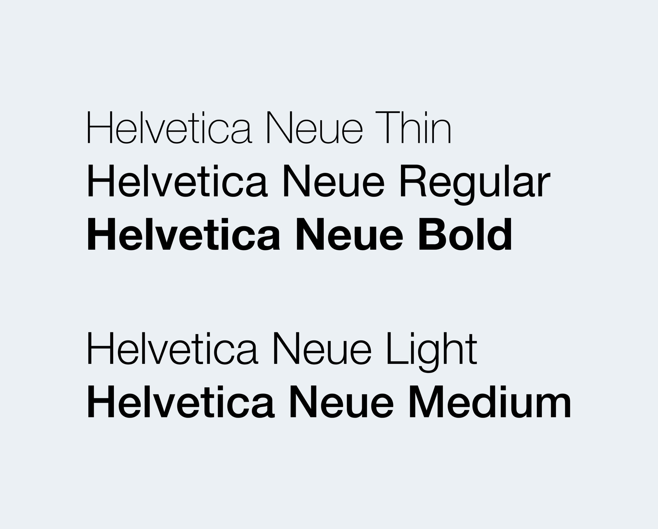
The typeface of WHU is the font family “Helvetica Neue.” It is used for all print, online business applications, and marketing communication.
For office communication (e.g., Microsoft Word or Outlook), the business typeface can be substituted with Arial. However, it is important that these two typefaces, Helvetica Neue and Arial, should not be mixed within one medium. Helvetica Neue, wherever possible, is the preferred font.

Font Weights
In most cases, the font weights Helvetica Regular and Bold are used.
When working on your own designs, please limit the number of different weights to a maximum of three. To preserve visual clarity when working with several font weights, make sure only to use every second weight, skipping one in between:
(e.g., Thin, Regular, and Bold; or Light and Medium)
− Regular text should always be set to either Light or Regular.
− Headlines should always be different from regular text using a different font weight.
Italic can be used for highlighting citations, for instance.
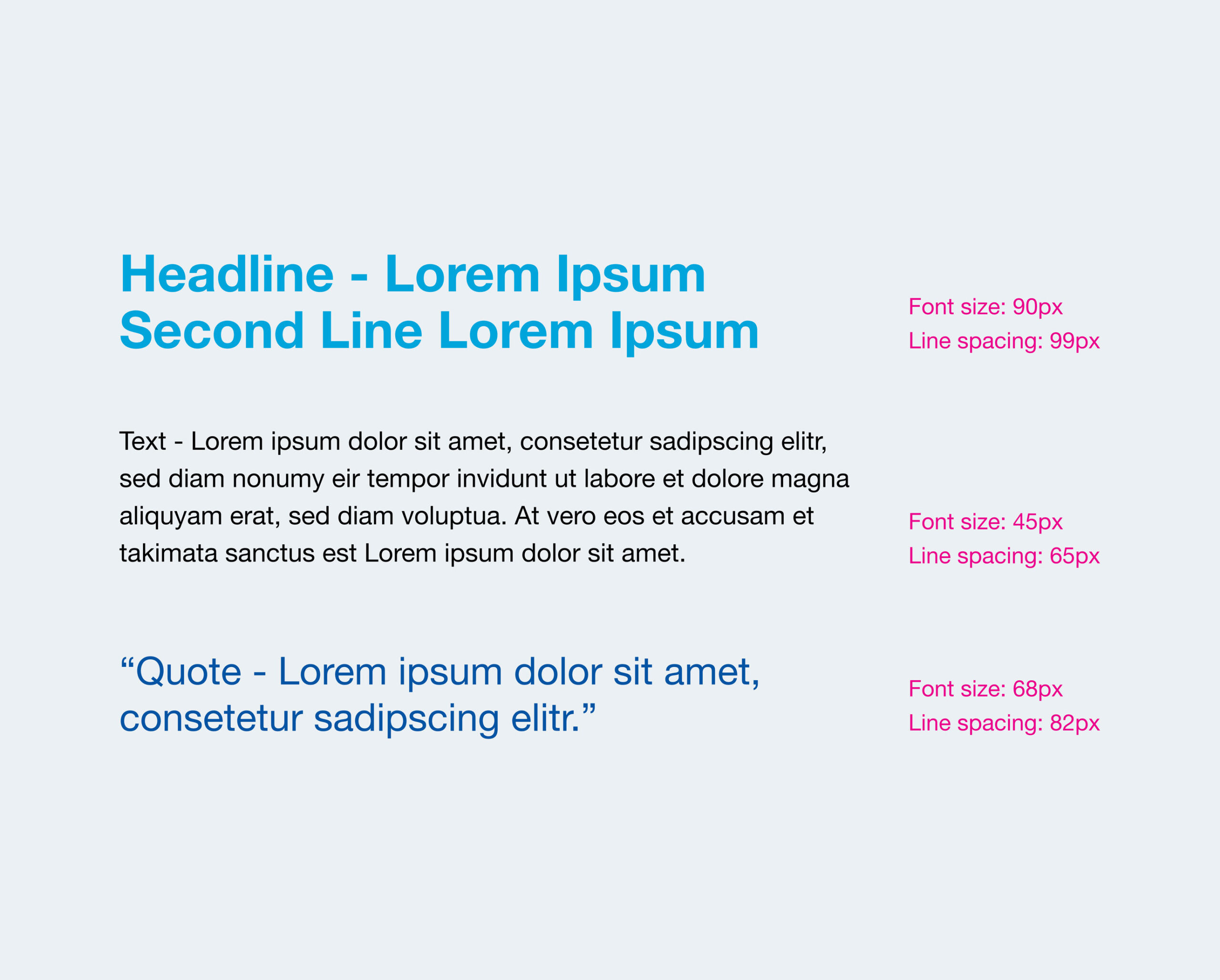
Application Guidelines
Line Spacing (Leading)
− Headlines should use 110% of their font size
− Running texts should use 145% of their font size
− Very short text elements should use 120% of their font size
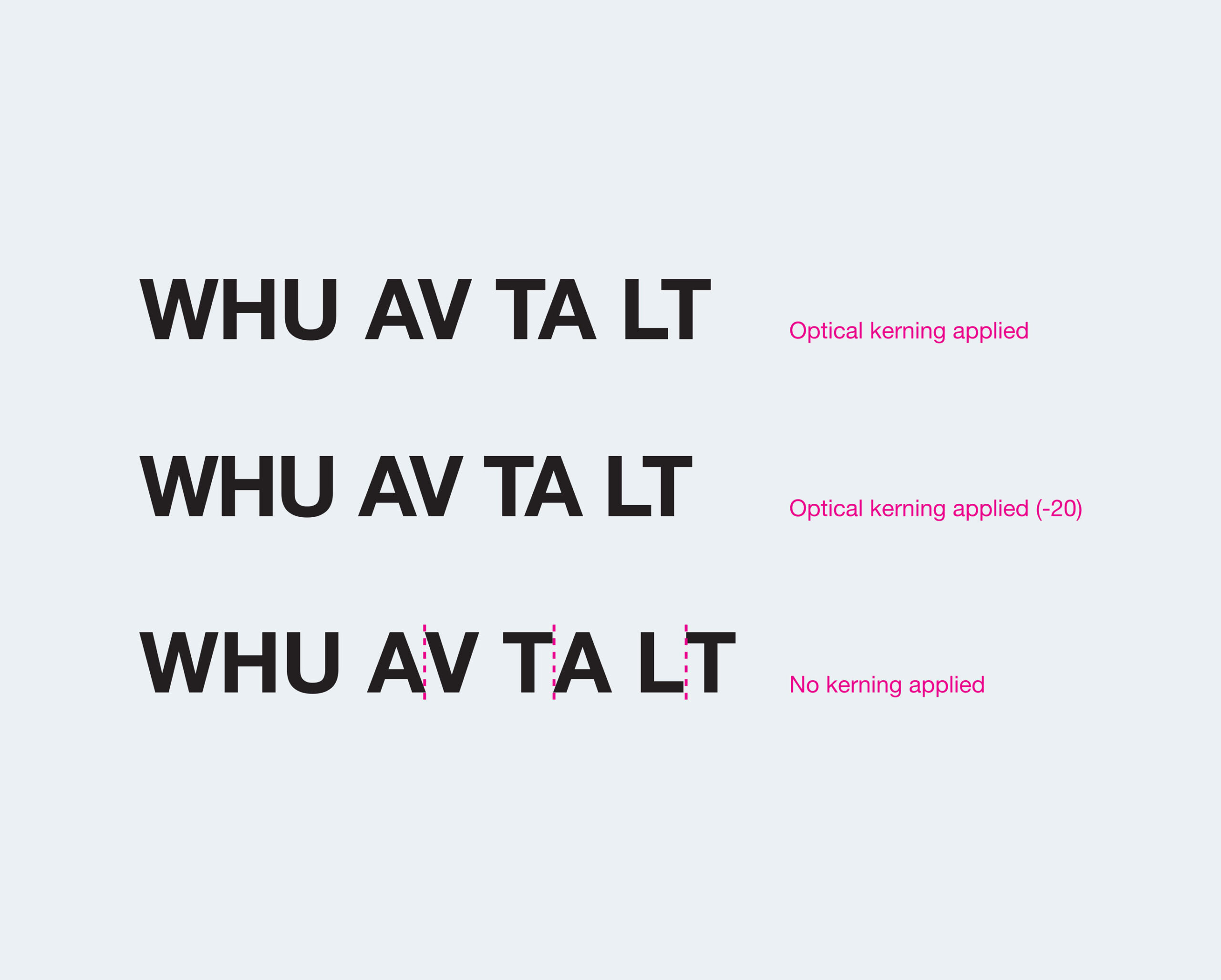
Letter Spacing (Kerning)
The letter spacing should always be set to “optical”
The kerning can be adjusted within a range from 0 to -20.
Usage of Typefaces
![[03] Typography Sample Page](https://whu.muenchimpact-projekte.com/wp-content/uploads/2025/10/Bildschirmfoto-2025-10-09-um-17.23.15.png)
Headline
Bold, 50 pt / 55 pt LP
Intro text
Light, 16 pt / 19 pt LP
Picture title
Roman, 7.5 pt / 9 pt LP
Decorative text
Bold, 50 pt / 55 pt LP
Text body
Light, 9 pt / 13 pt LP
Quote
Bold, 25 pt / 30 pt LP
Consignor quote
Bold, 9 pt / 13 pt LP
Headline
Bold, 13 pt / 16 pt LP
Bullet points
Light, 9 pt / 13 pt LP
Mark-ups
Bold, 12 pt / 15 pt LP
Chapter / Running title
Bold/Light, 7.5 pt / 9 pt LP
Page number
Bold, 10 pt
