


Suche
General Information
Our full brand name is “WHU – Otto Beisheim School of Management”.
In texts, the name must always appear written in its entirety, when mentioned for the first time, connected with an “en dash” (German: Halbgeviertstrich). After its first mention, the name can be abbreviated to “WHU”.
The WHU logo is composed of three essential elements: the abbreviation “WHU,” the figurative mark, and the line “Otto Beisheim School of Management.”
Color and Usage
Blue Logo
In its standard form, the logo appears in WHU blue on a white background and should be used together with the WHU claim whenever possible.
White Logo
Alternatively, a version in white is available for dark backgrounds.
The logo should not be colored in any other way.
Rotation
The default rotation of the logo is horizontal. In rare cases
(e.g., on flags or vertical objects), it may also be rotated by 90°.
The logo should not be rotated in any other way.

Scaling
The logo should never be stretched in any dimension.
Please make sure always to keep its original ratio.
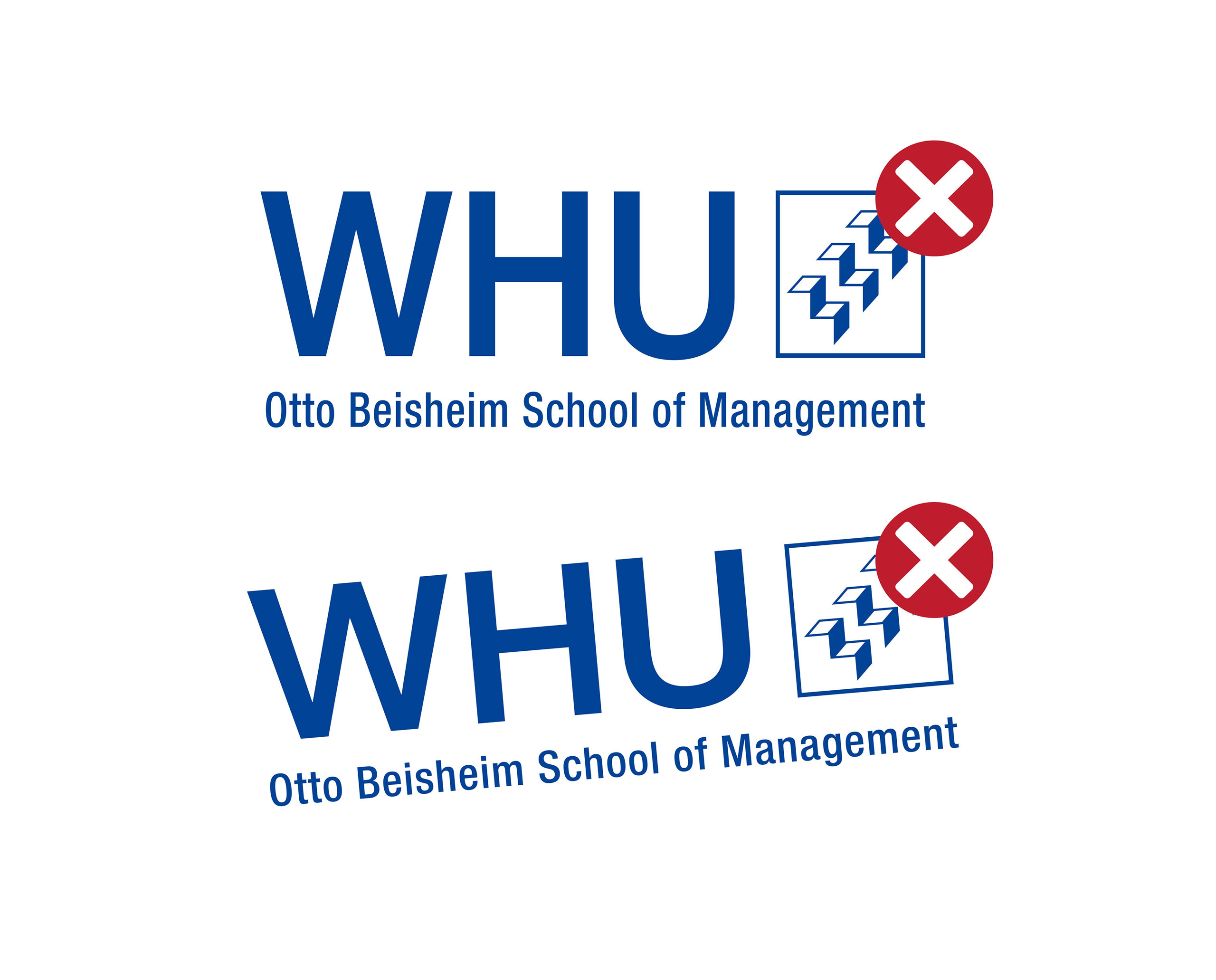
Outdated Logos


Claim
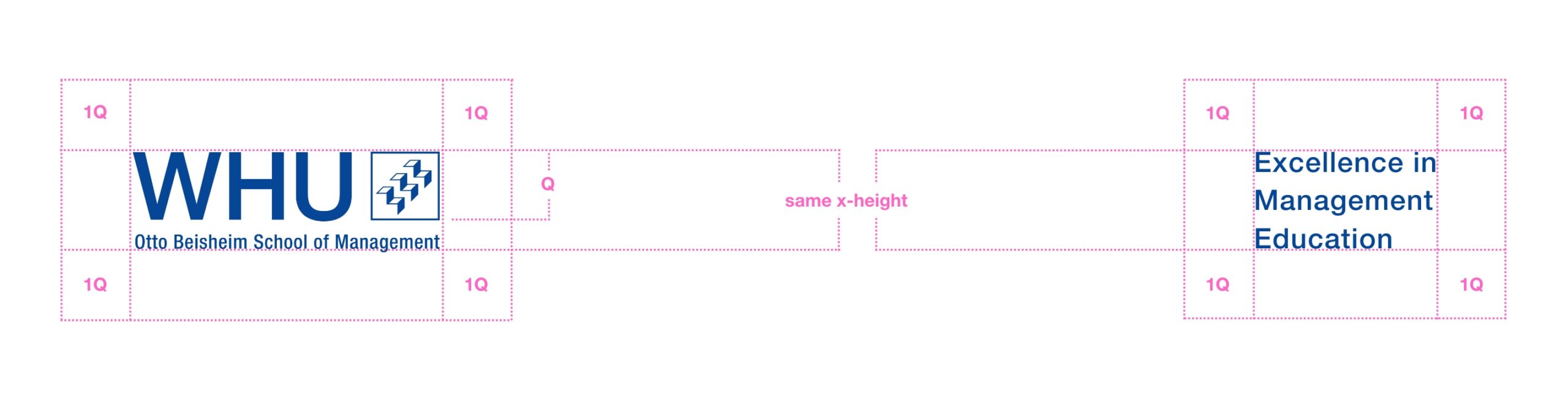
Standard Claim
The logo and claim are representative of WHU.
Our standard claim reads: “Excellence in Management Education.”
Ideally, the logo and claim should be used together. Exceptions are made for small formats and merchandise when there is a lack of space.
The claim is written in Helvetica Neue Medium.
In the standard version of the logo and the claim, the color is WHU Blue on white.
A white version for dark backgrounds is also provided. Within one medium, the logo and claim should be used in the same color and placed on the same surface.

Applied Sizes and Placement
Logo and claim are always placed at the same x-height.
The protection zone around the logo equals the size of the figurative mark (1Q).
To offer as much design freedom as possible, the logo and claim can be used in a flexible manner. However, they must be aligned either horizontally or vertically.
Co-Branding
The WHU logo or the WHU consignor can be combined with other elements for programs, events, student clubs, and sponsors.
There are two possible methods:
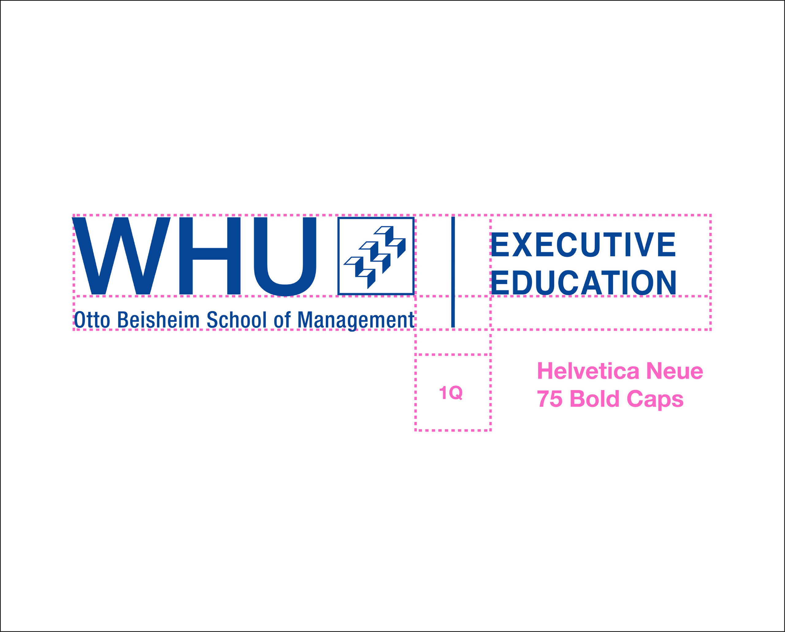
WHU Logo and Signage with Additives
In addition to the WHU logo and/or WHU consignor, sponsor logos and program titles can be added. The WHU logo and consignor must be recognizable as a distinctive logo. The additional titles are placed to the right of the logo.
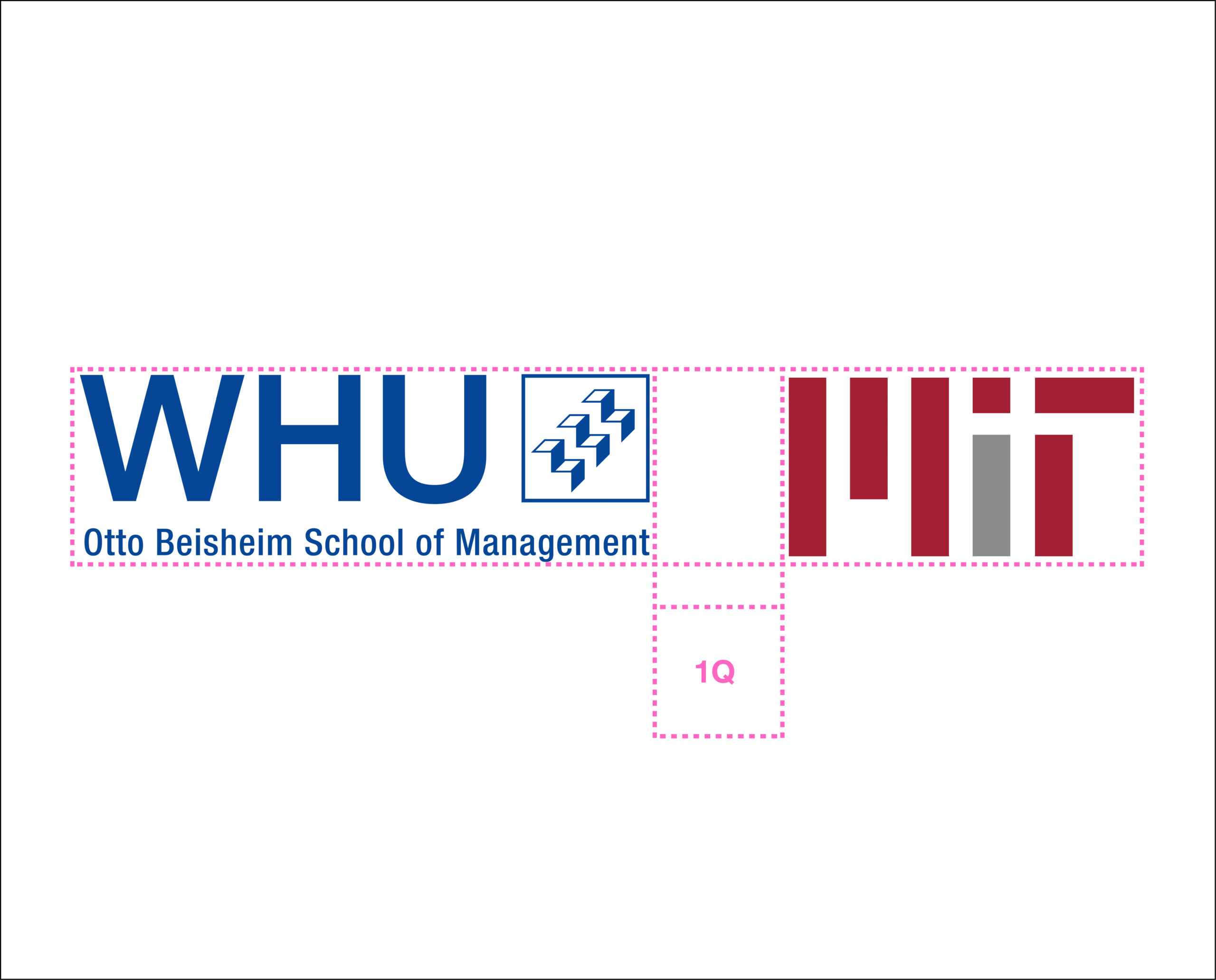
The logo and the added title can be separated by a 1 pt thick line. There must be a distance of at least ½ Q or 1 Q between the logo and consignor (1 Q equals the figurative mark’s height and width).
WHU Logo and Signage as Additives
Some student clubs, chairs, or projects have their own logo. To ensure that these are recognized as part of WHU, the following steps should be taken when creating a logo:
− Mentioning WHU
− The word “WHU” must be written in the font Helvetica Neue Medium

Logo Variation for Social Media
For designs where the full logo is not needed, it is possible to use a reduced version with just the box logo. This version consists only of the figurative mark.
All general above-mentioned rules for our primary logo also apply here.


WHU Student Club & Events
For all design elements and branding rules specific to WHU student clubs, please refer to the dedicated information. It offers clear guidance on logo usage, colors, typography, and co-branding.
